
Much has been made for responsive web design and mobile first web design theory… And rightly so. With the proliferation of smaller and increasingly diverse devices popping up every day, there needs to be an answer for all these user’s needs. Yet, with the trend towards developing for smaller devices, have we gotten away from our primary audience? An audience – of course – that consists of those using a desktop or laptop with a large monitor? The answer is yes, and Upward Responsive web design may hold the answer.
A Dose of Statistical Reality
As we all know, mobile devices are increasing at a tremendous rate, and so is the web traffic coming from these devices. Recent statistics put smart phone and tablet traffic share at 5.44%. Lost in mobile shuffle is that web traffic from those using larger monitors is also growing.
When I first began in the web design and development industry, we targeted screen sizes of 800 x 600. At that point in time, that was what people were using… But, as technology advanced, we slowly moved towards 1024 x 768 sizes, and even – God forbid – fluid layouts at slightly larger sizes. Smartphones began to hit and RWD/mobile first design became all the rage. Since then, it is important to analyze what has happened to other screen size usage as well. Let’s take a look at web traffic share from small, mobile device sizes along side their larger desktop screen size counter parts:
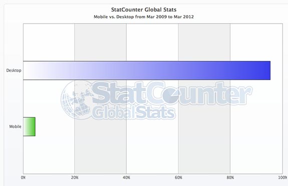
Web Traffic – Web vs Desktop
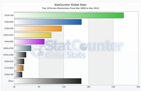
Web Traffic by Screen Resolution
In a nutshell, research shows that an average web site can typically expect between 5-8% of their traffic to come from small, mobile devices. As for desktop users with screens at or over 1024 pixels wide? A whopping 83.78%.
As is clearly seen, by focusing solely on mobile first we get to the point where we betray the core users of our websites… And, in the meantime, only benefit by catering to a minority of web traffic. Many can argue that in their pure form, RWD, mobile first and even progressive enhancement web design theory takes into account this larger base of desktop users. But, in all reality, this has not been put into practice. After all, when’s the last time you heard anyone discussing media queries larger than 1200 pixels? Further, take a look at these well known, responsive sites at 1920 x 1080:
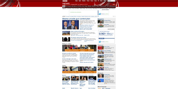
The BBC responsive site at large screen dimensions
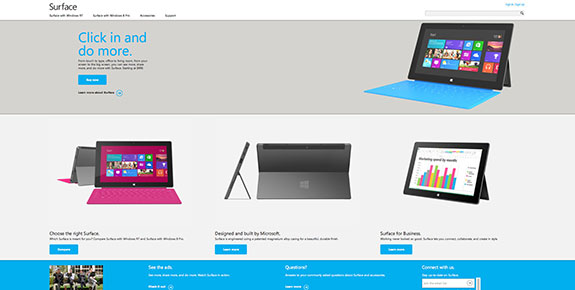
The Microsoft Surface responsive site at large screen dimensions
See any problems? They may look great for mobile users and those that view the site at smaller widths, but they look simply awful for everyone else. Again, “everyone else’ in this scenario counts for up to 84% of website visitors.
The Answer? Upward Responsive Web Design.
Upward Enhancement was first coined by Chris Butler of Newfangled in his fantastic article “What We’ve Learned About Responsive Web Design”. In the article, he states:
“What about upward responsiveness? If we’re heading toward bigger displays with much higher pixel density, how will our designs adapt to make use of them? We’re all excited and sold on the concept of responsive design, but so far that has been limited to responding to smaller conditions. If we’re up for that challenge, than I know we can do better on the “desktop,” too.”
So, how can Upward Responsive design help web developers? In three key ways:
- Larger media queries – Don’t just stop your media queries at 960 pixels in width and call it a day. Take a good, long look at your Google Analytics data and find out at what sizes your site is being viewed. Then, add in larger break points for these sizes.
- Flexible, Horizontal Columns – Much of responsive web design is based around stacking columns vertically. Implement upward enhancement by floating content horizontally as well as vertically.
- Introduce New Content – Whether it be content, graphics, multimedia or – gasp – Flash, why not add in some content for large screen viewers? Not only will it make their experience all the richer, it will not treat others as second class citizens. The extra material is simply added, bonus material anyway and will not detract from the experience of those who can’t see it.
What does the above suggest? A push towards Upward Responsive web development and design. By mixing in a little progressive enhancement with your responsive web design, you can begin keeping all user’s needs in mind. And yes, mobile first in theory does account for larger screen sizes. But, lets face the facts that you can only stick so much content onto certain smaller devices before the larger ones begin looking bare in comparison.